Your first plan in a minute
The fastest way to understand QPI is to give it a plan. You do not need a database connection for this. A saved plan file is enough.
Step 1: Get a plan file
If you already have a .sqlplan file, use that. If not, capture one from a query you care about:
- In your query tool, turn on the actual execution plan (in SQL Server Management Studio that is Ctrl+M, or the “Include Actual Execution Plan” button), then run the query.
- Right-click the resulting graphical plan and choose Save Execution Plan As, and save it as a
.sqlplanfile.
An estimated plan works too. QPI reads both, and it tells you which kind you are looking at. Actual plans carry runtime numbers (real row counts, timings, waits, spills), so they give you more to work with.
Step 2: Drop it into QPI
Open QPI and drag the .sqlplan file onto the drop zone. You can also click the drop zone to browse for a file. QPI accepts .sqlplan files and raw Showplan .xml files.
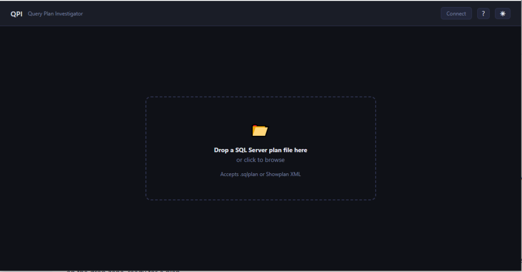
Step 3: Read the findings
QPI parses the plan and lands you on the Overview tab. Scroll to the Findings section. This is the part you came for.
Each finding has a severity icon, a one-line summary, and the rule that produced it. Click one to open it.
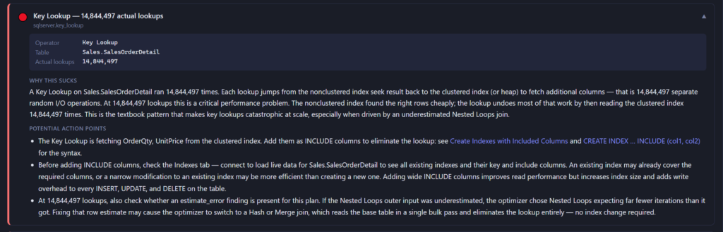
Inside each finding you get:
- Evidence: the specific numbers from the plan that triggered the finding.
- Why this sucks: what is actually going wrong and why it costs you.
- Potential action points: what to check or change next, frequently with ready-to-run T-SQL.
The severity colours are quick to scan:
| Icon | Severity | Read it as |
|---|---|---|
| 🔴 | Critical | Likely hurting this query now. Look first. |
| 🟡 | Warning | Worth your attention. |
| 🔵 | Info | Context you should know about. |
If QPI finds nothing, it tells you that too, with a clear “No issues detected”. That is a real answer, not an “It depends” .
That is the loop
Load a plan, read the findings, act on them. Everything else in QPI deepens that loop:
- The other tabs break down statistics, waits, runtime, and indexes. See Reading a plan.
- The plan diagram gives you the visual layout when you want to trace data flow. See The plan diagram.
- Connecting to the live server turns the findings from informed guesses into measured facts. See Connecting to a live server.