The plan diagram
Sometimes you need to see the shape. The Plan Visualization tab draws the execution plan as a diagram so you can trace how data flows from the leaf operators up to the root.
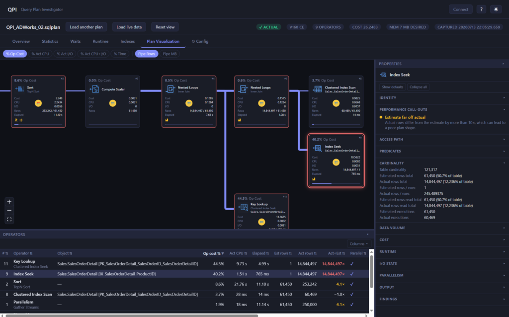
The Plan Visualization tab with the operator diagram in the centre, the properties panel docked on the right, and the operators table docked along the bottom.
Reading the diagram
Data flows from right to left and bottom to top, the same direction SQL Server itself reads a plan. Each operator is a card showing its type, the object it touches, and its cost contribution. The arrows between them are sized by the rows flowing through, so a thick arrow feeding a thin one is an easy way to spot where the row counts collapse.
You can pan and zoom freely. If you lose your place, the Reset view button in the plan bar fits the whole plan back into the window.
Cost colouring
The diagram can colour operators by different cost metrics so the expensive parts stand out. For estimated plans you can colour by % Op Cost, % CPU, % I/O, or % Rows. For actual plans you also get the actual-cost variants (% Act CPU, % Act I/O, % Act CPU+I/O), which are based on what really happened rather than the optimizer’s guess. Switching metric is the quickest way to answer “where is the time actually going”.
Dockable panes
The visualization is laid out like a proper analysis surface, not a static picture.
- The properties panel docks on the right. Select an operator and it shows the full property set for that operator, the same detail you would dig for in the built-in viewer, without leaving the diagram.
- The operators table docks along the bottom. It is the whole plan as a sortable grid, so you can sort by cost, rows, or reads and jump straight to the worst offender instead of hunting around the canvas.
Both panes resize by dragging their edge, and both can be collapsed when you want the diagram to fill the space. QPI remembers your layout between sessions, so the workspace stays the way you set it.
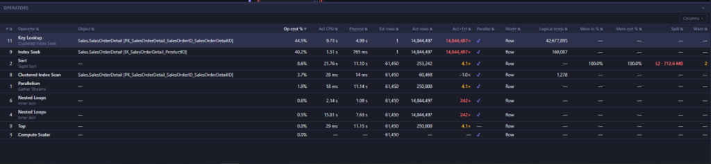
The operators table docked at the bottom, sorted by a cost column so the highest-cost operator sits at the top of the grid.
Findings show up here too
Operators that a finding points at are highlighted in the diagram, so the visual view and the findings list stay in step. When a finding says a particular sort spilled or a particular lookup is expensive, you can see exactly where it sits in the plan.
Why this beats squinting at the built-in plan
The graphical plan in most tools puts everything in one fixed view: the diagram, the tooltips, the properties grid, all fighting for the same space. QPI lets you keep the diagram, the properties, and the full operator grid on screen at once, size them how you like, and colour the plan by the metric you actually care about. It is the difference between reading a plan and wrestling with one.